
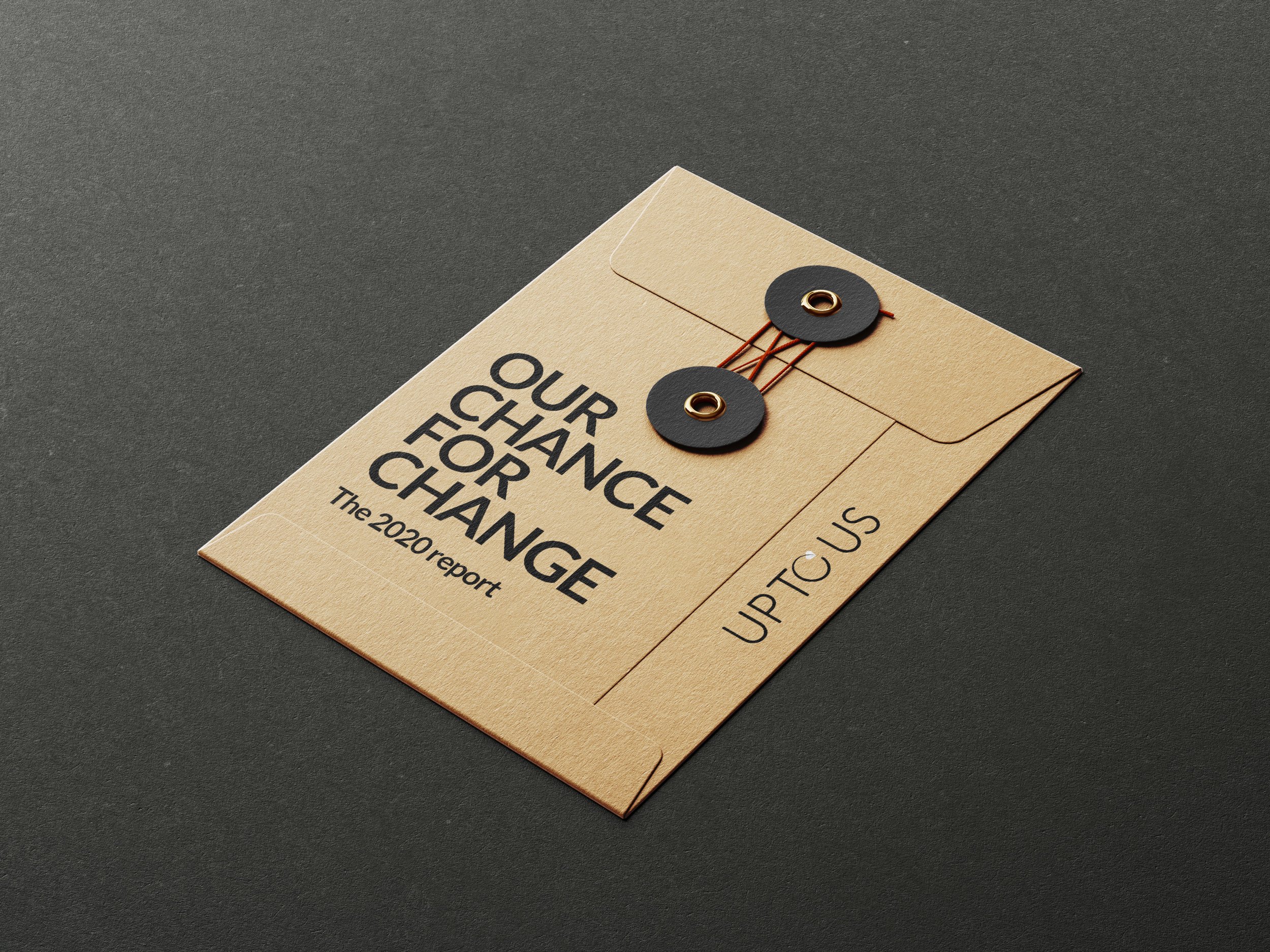
UP TO US
A VISUAL IDENTITY FOR A SUSTAINABLE VISION
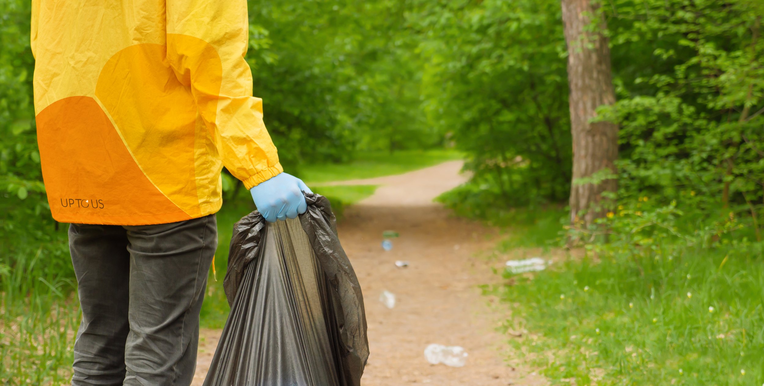
The UP TO US programme is initiative to produce and implement sustainable programmes for better sustainable living.
The brief
The former identity had become dated, cliche and not fit for purpose. UP TO US required a new modern approach, to match their new upcoming relaunch., where their new five pillar sustainability strategy would be revealed.


Old Logo

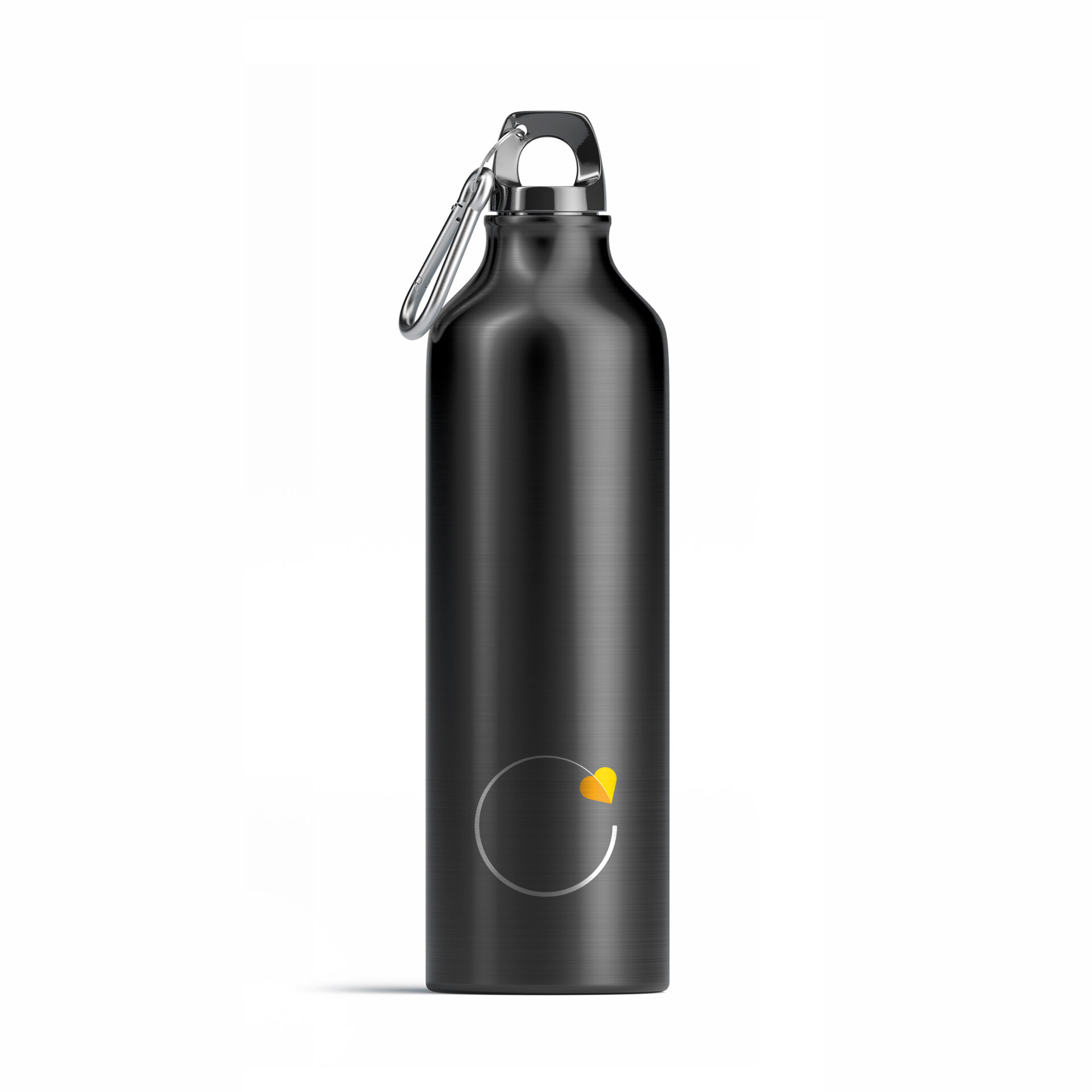
New Logo
Solution
The new mark is based on optimism and hope. It retains reference to previous logo, with the leaf reinvented into brighter yellow and orange, and also doubled up as an arrow or heart.

The hidden meanings behind the new logo. Each of the five new strategy pillars are represented:
-

Zero Carbon (Circular)
We will reduce carbon emissions from new and existing buildings in line with climate science, ahead of the timescale set out in the Paris Climate Agreement to avoid the worst impacts of climate change.
-

Health and Wellbeing (Heart)
Driving real improvements in physical and mental health and wellbeing based on an understanding of their needs, through improvements to our service model, physical assets and employee support programmes.
-

Leading the sector (Directional arrow)
We will work to raise standards across the student housing sector and deliver value to our customers and investors.
-

Resource efficient (Leaf)
We will reduce the environmental impact of our new and existing buildings by improving energy and water efficiency, and also help everyone to adopt lasting sustainable living habits.
-

Opportunities for all (Butterfly)
Including customers, employees and in the communities where we work, where all can succeed, whatever their background, gender or ethnicity.