
NATS
MAKING A VISUAL IDENTITY OUT OF THE BUSY INVISIBLE WORLD ABOVE US
NATS are the leading provider of air traffic control services in the UK.
They plot the invisible paths that keep the skies safe. And on the ground they work with airports, airlines and governments to advance aviation.
We were challenged to bring what they do and who they are to life… bringing the complex invisible world into a new visual identity.
-
We were challenged to bring what they do and who they are to life… bringing the complex invisible world into a new visual identity.
-
NATS are the leading provider of air traffic control services in the UK.
-
The new brand identity presents a distinguishable face for NATS, an integrated platform with a new Flightmark logo, colour and graphic design system that reflects precision and accuracy, transparency and a human connection.
BRAND IDENTITY | BRAND STRATEGY | GUIDELINES
CREDIT: Produced with The Team - Creative branding and communications consultants


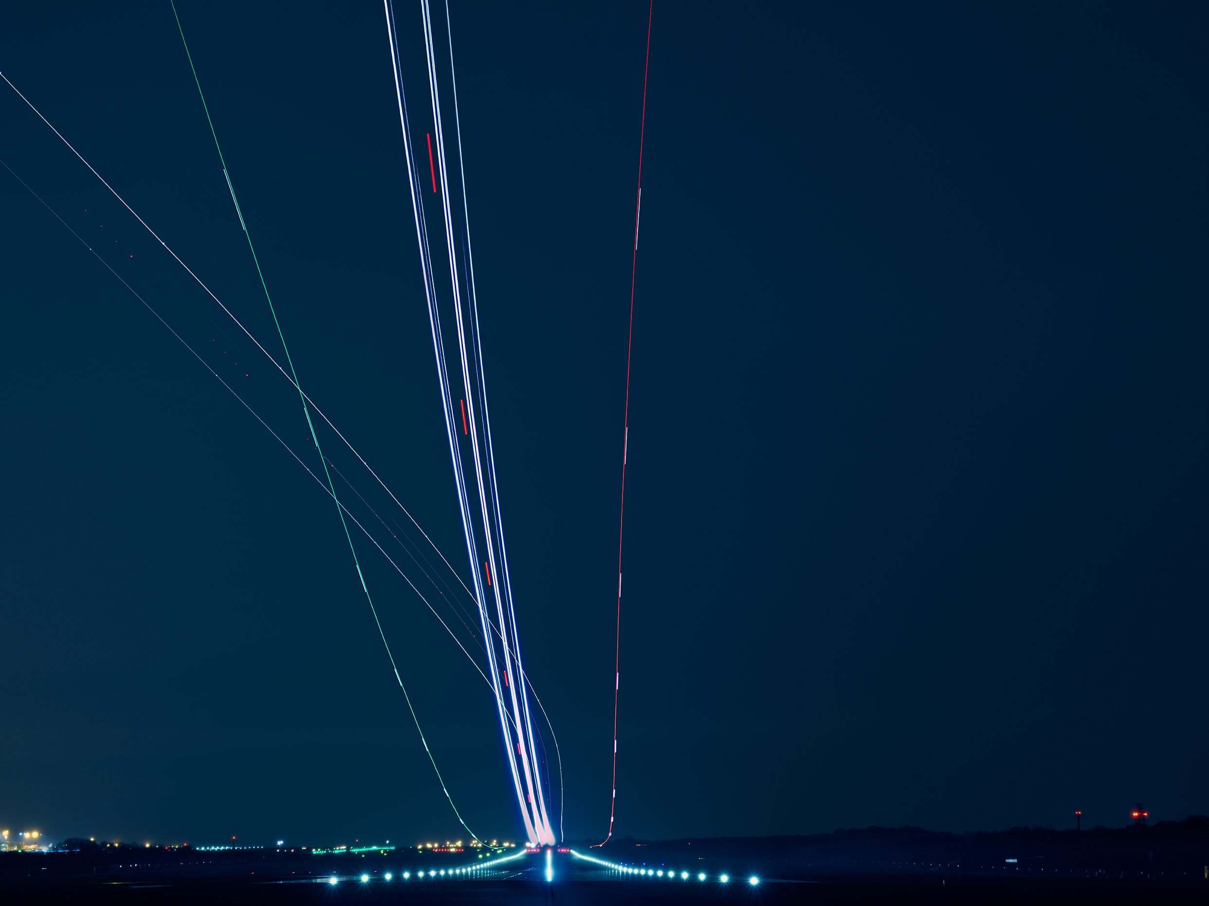
Long-exposure photography illuminates the complexity and precision of what NATS does every day. Revealing the invisible ‘highways in the sky’. The thread which runs through the refreshed brand identity, from logo, photography, graphics and even iconography.


BEHIND THE SCENES
Logo exploration and crafting workshops


