Tips&Bricks
BUILDING AN IDENTITY BRICK BY BRICK
A unique identity for the Lego fan blog - Tips & Bricks. One of teh leading online communities celebrating interesting models and unusual techniques.
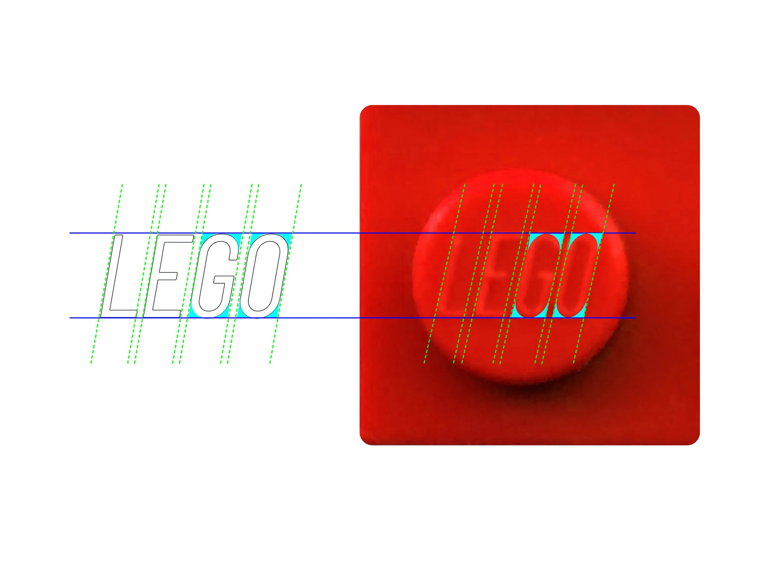
The identity is based on the structure, proportions and ratio of actual Lego bricks. .
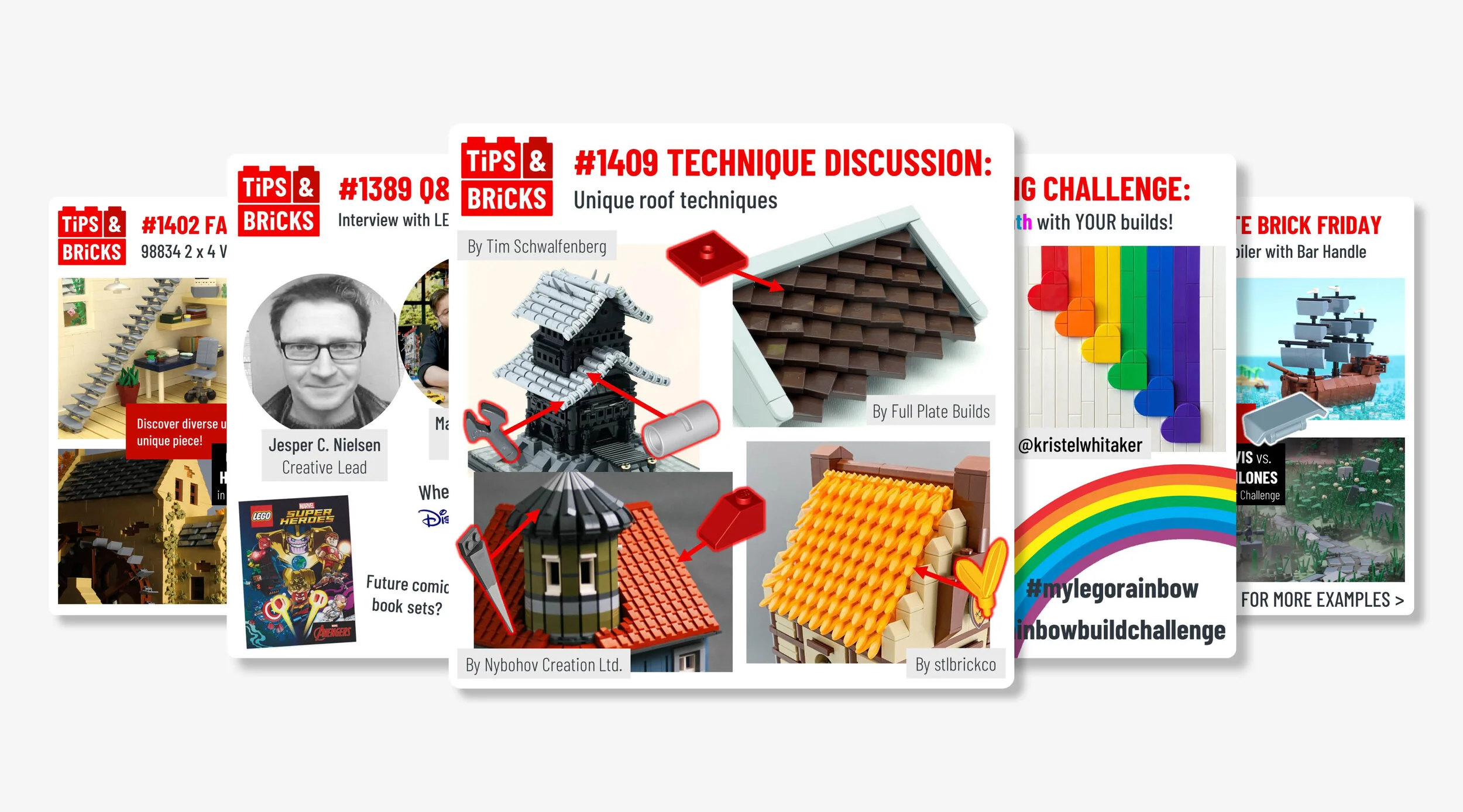
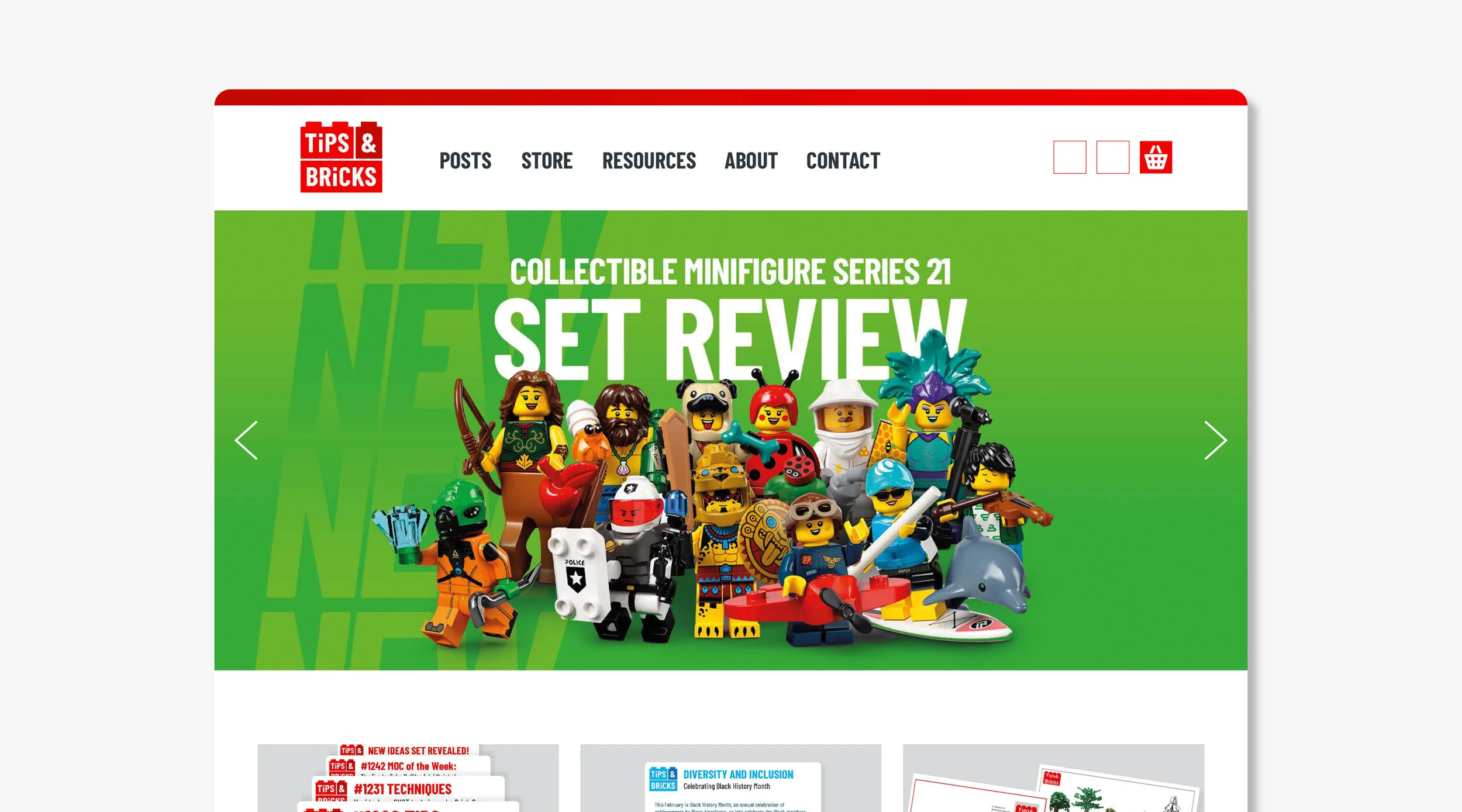
Building the logo
The updated Tips&Bricks logo has been produced using the same ratio dimensions of actual Lego bricks. This feels like the right way to create the logo, given they are a source for precise, details and technical creations.
Plus after all, Bricks are in their name, so now they’re in our logo too!
Meaning behind the typeface
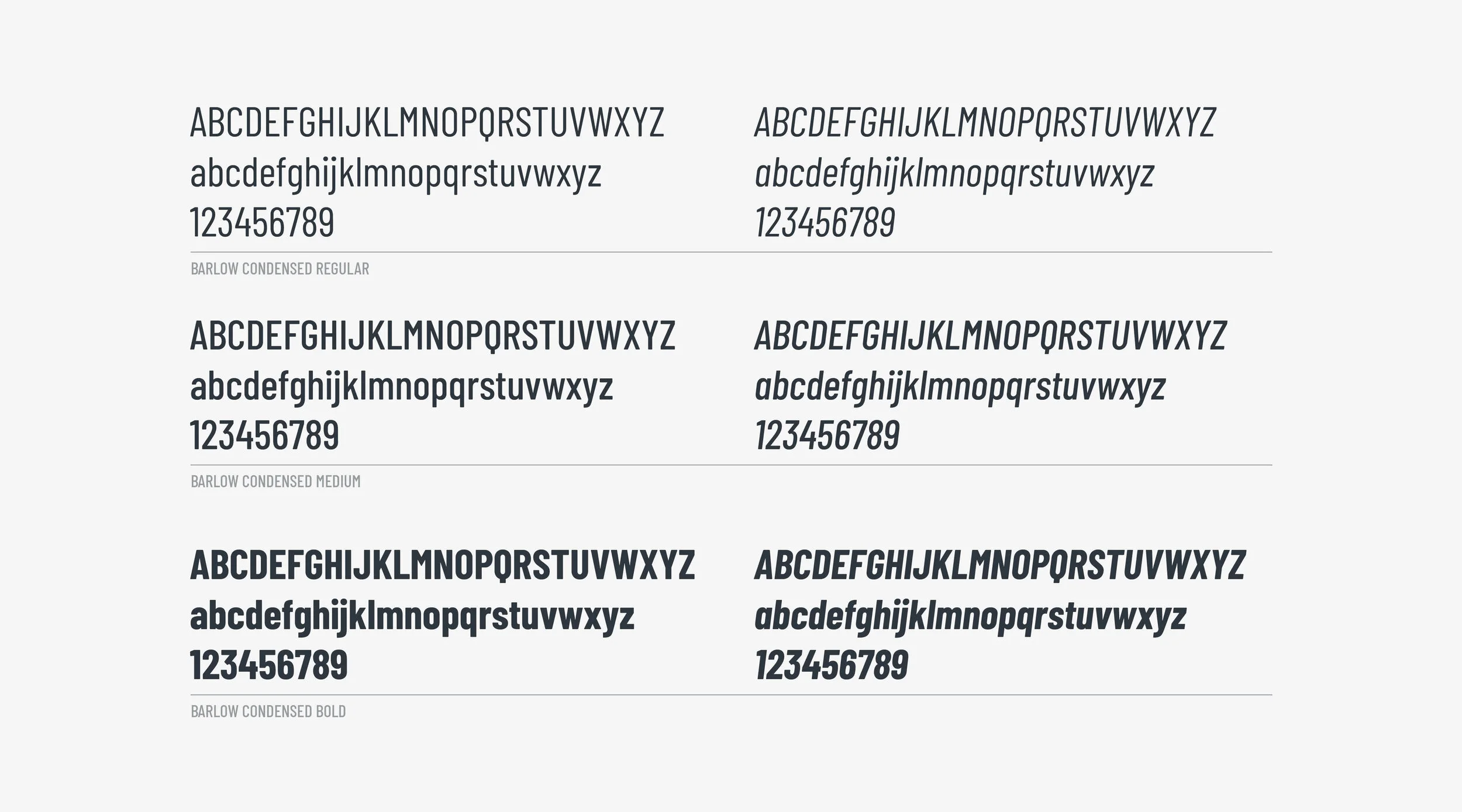
The distinctive tall and narrow character forms with subtle rounded edges, are not only just a distinctive quality for the blog, but as an added bonus, when using italic capitals it creates an uncanny resemblance to the font used by Lego on every brick every made.
The Barlow font family is naturally crafted to be as suitable and effective on digital platforms/screens (essential for Tips & Bricks as most communications are online) but it is also just as effective for print production.
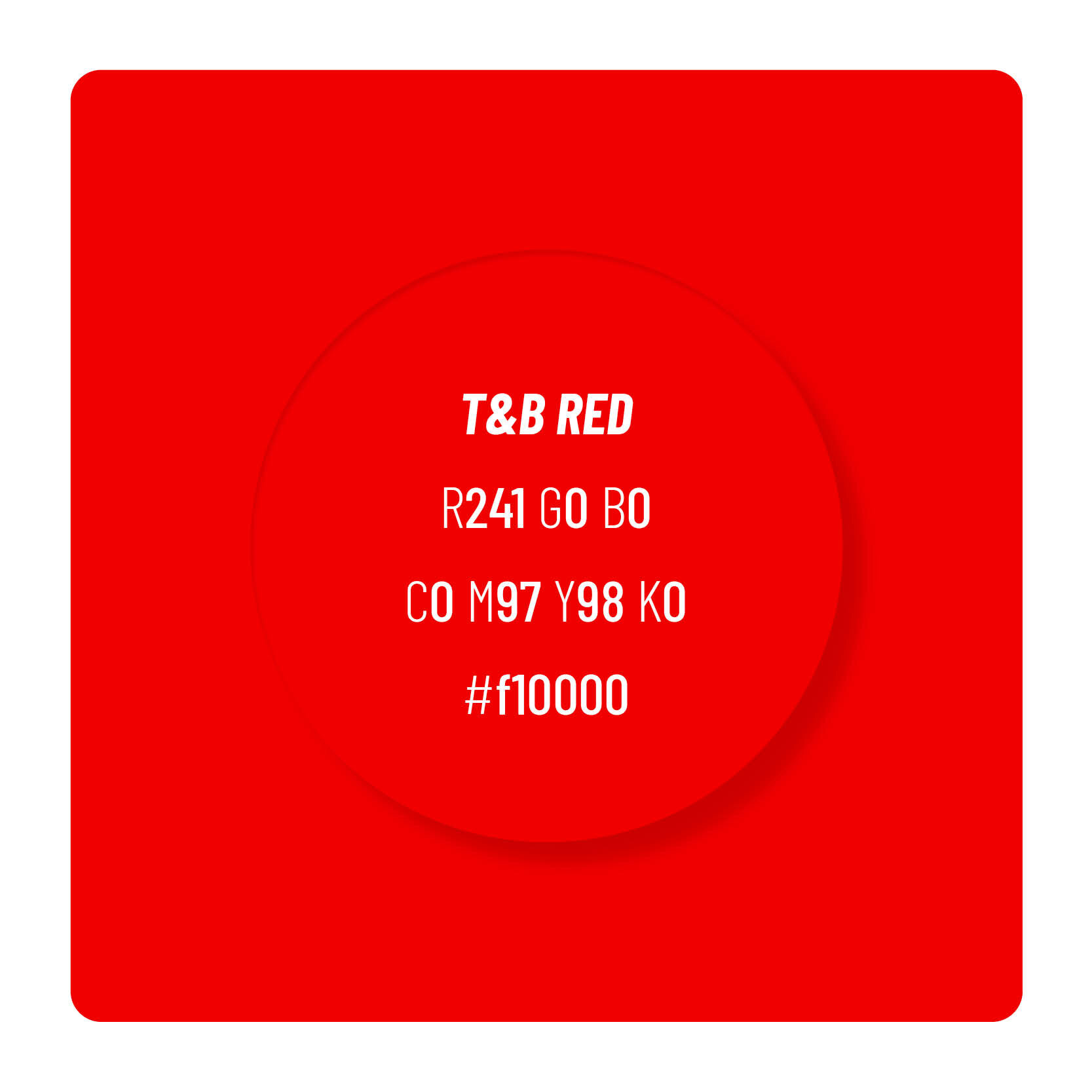
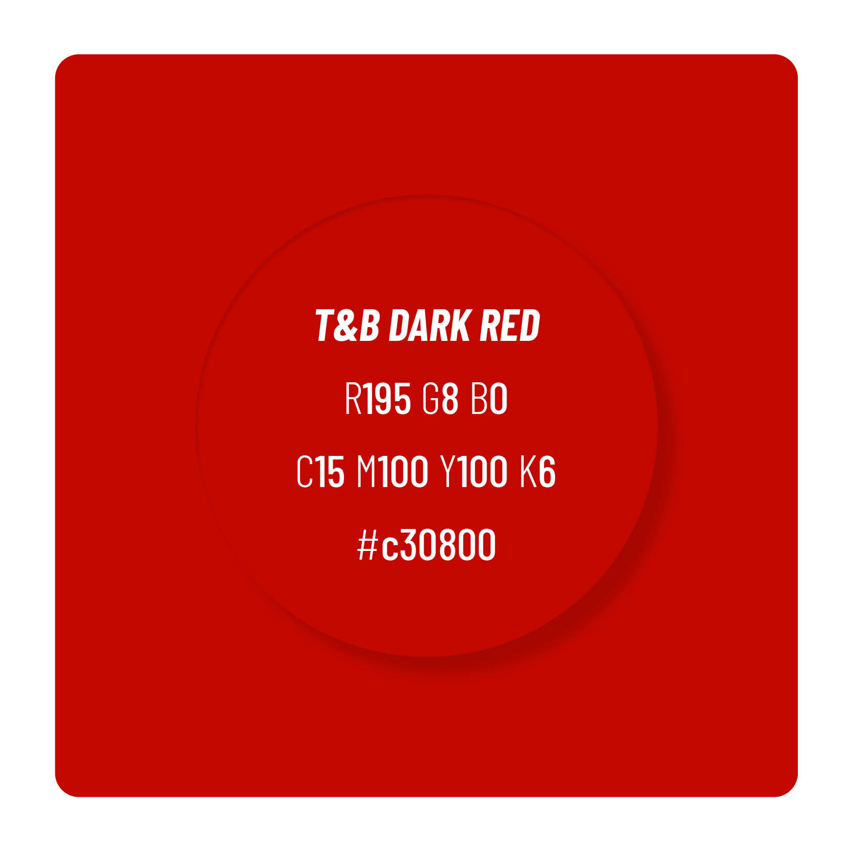
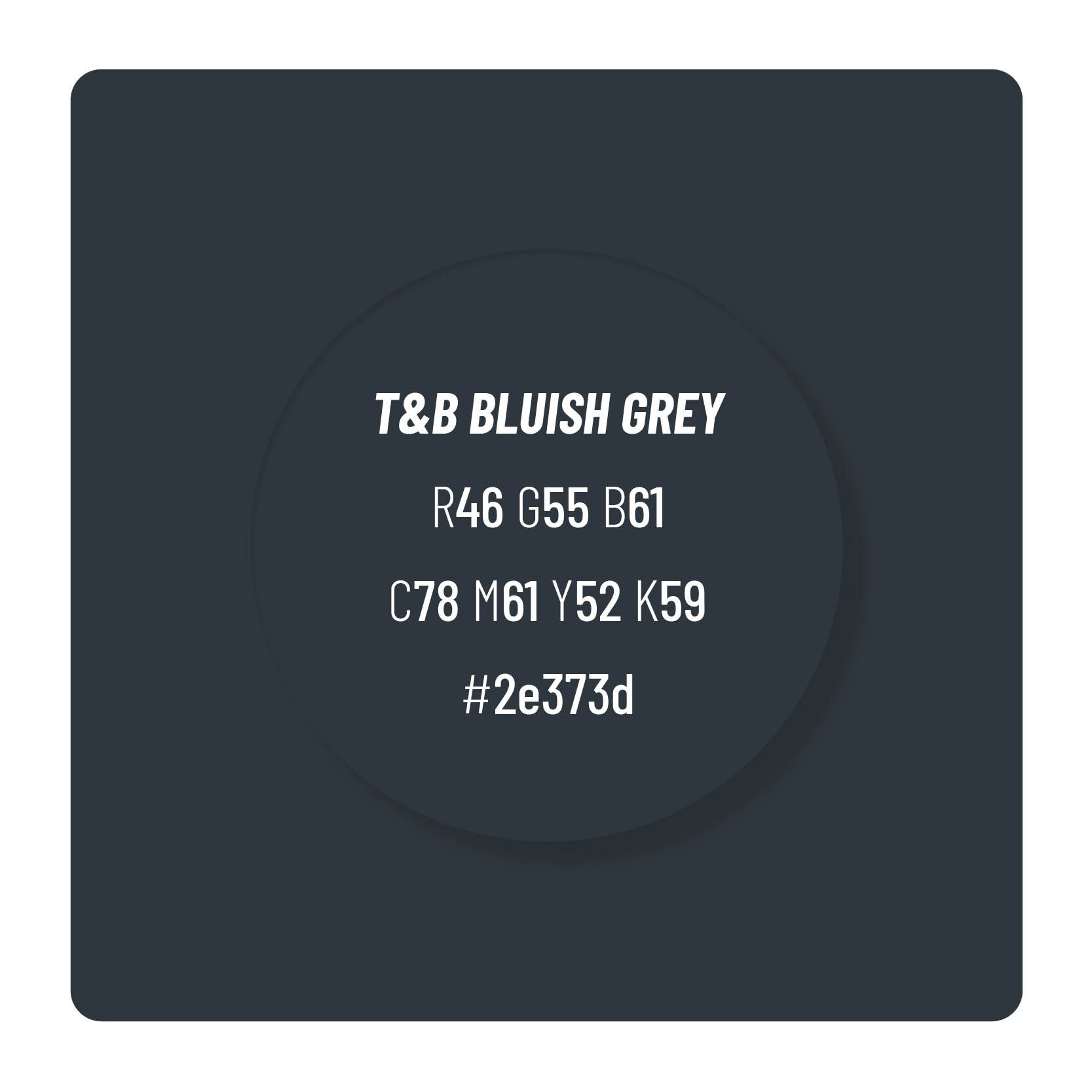
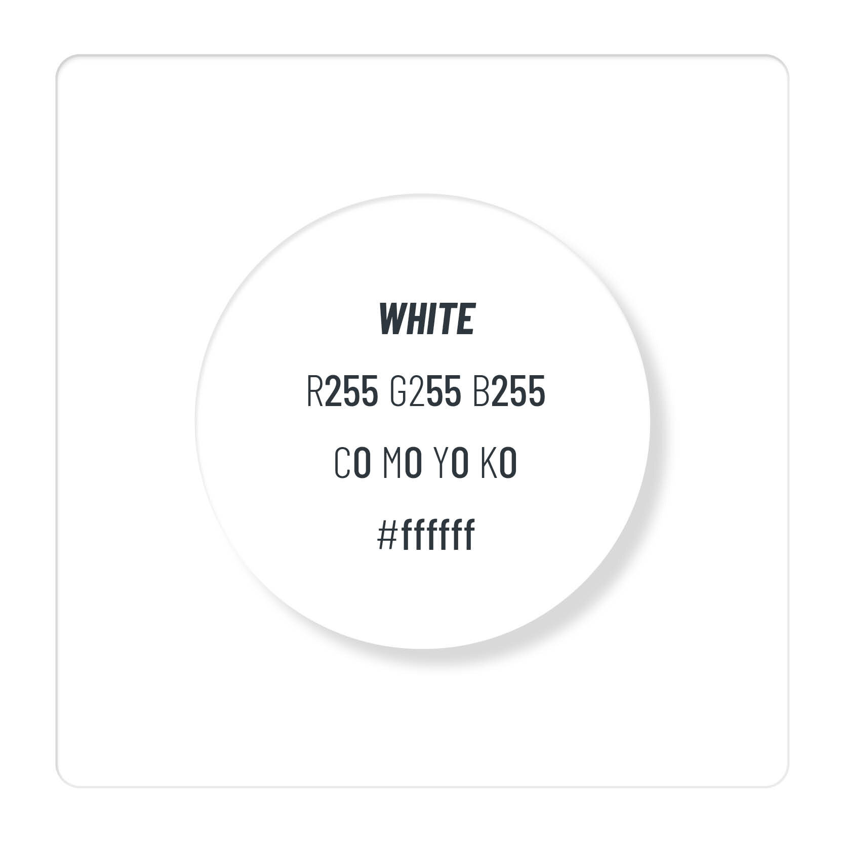
Colour palette