Prime Quarters
CRAFTING THAT HOME FROM HOME FEELING FOR EVERY CUSTOMER
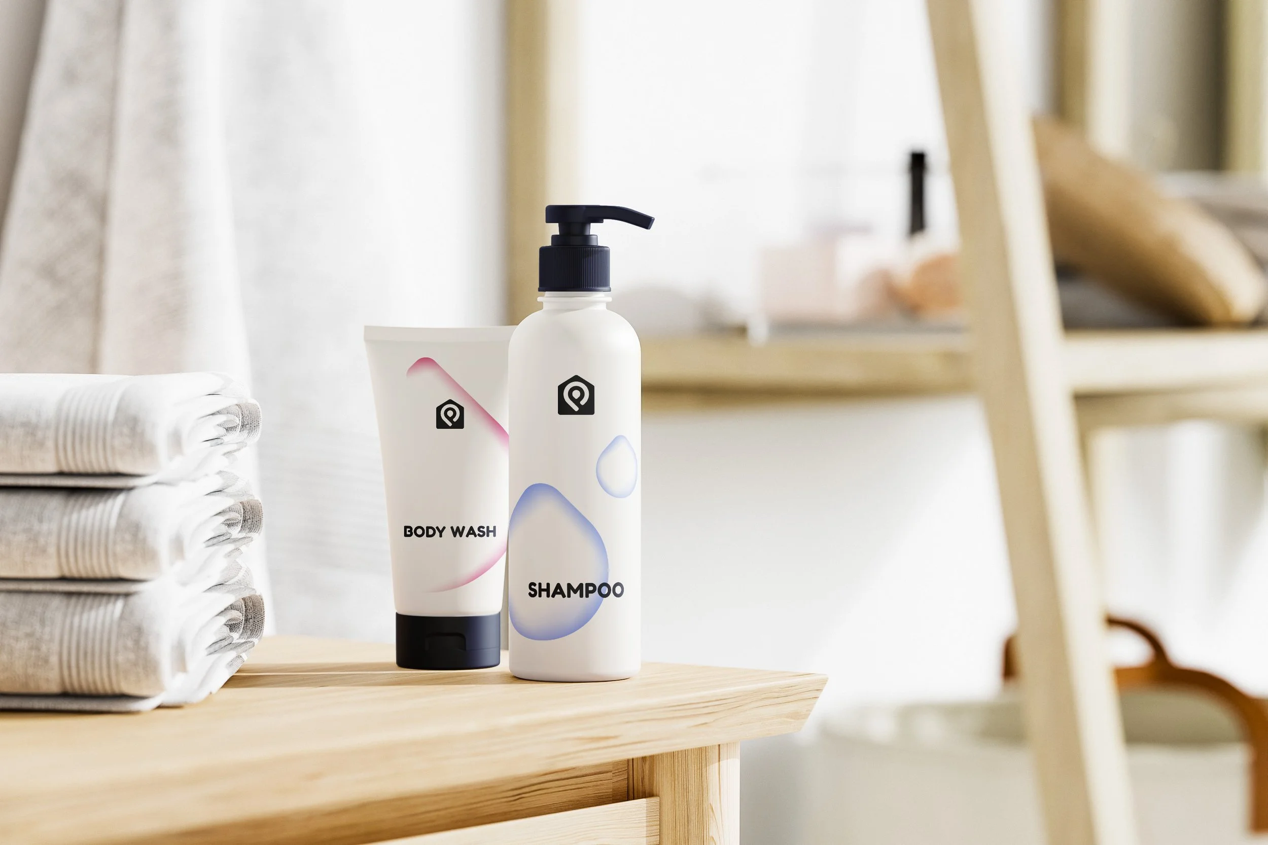
Brand identity development and rollout for short term holiday lettings agency, Prime Quarters.
CONCEPT | BRANDING | GUIDELINES
-
Prime Quarters needed a brand update to ensure they maintained standout within a fast pace and growing market. With a digital first approach key throughout along with consideration on how the brand is portrayed in a physical environment.
-
Prime Quarters operate luxury holiday lets and short term accommodation.
-
Premium, luxurious yet fun - a challenging combination to build a coherent brand upon. The visual identity has been created to represent the quality of the properties, the efficiency of service plus individuality against competitors within the sector.
CREDIT: jonquinnell.com
A new icon, with meaning
The logo icon is built with multiple hidden meanings that appropriately represent the business.


Grammar greetings
With digital bookings and accommodation self check-in, it became apparent how vital written communication would play in setting the scene for arriving guests, adding a touch of playfulness, friendly tones in addition to of course informing.