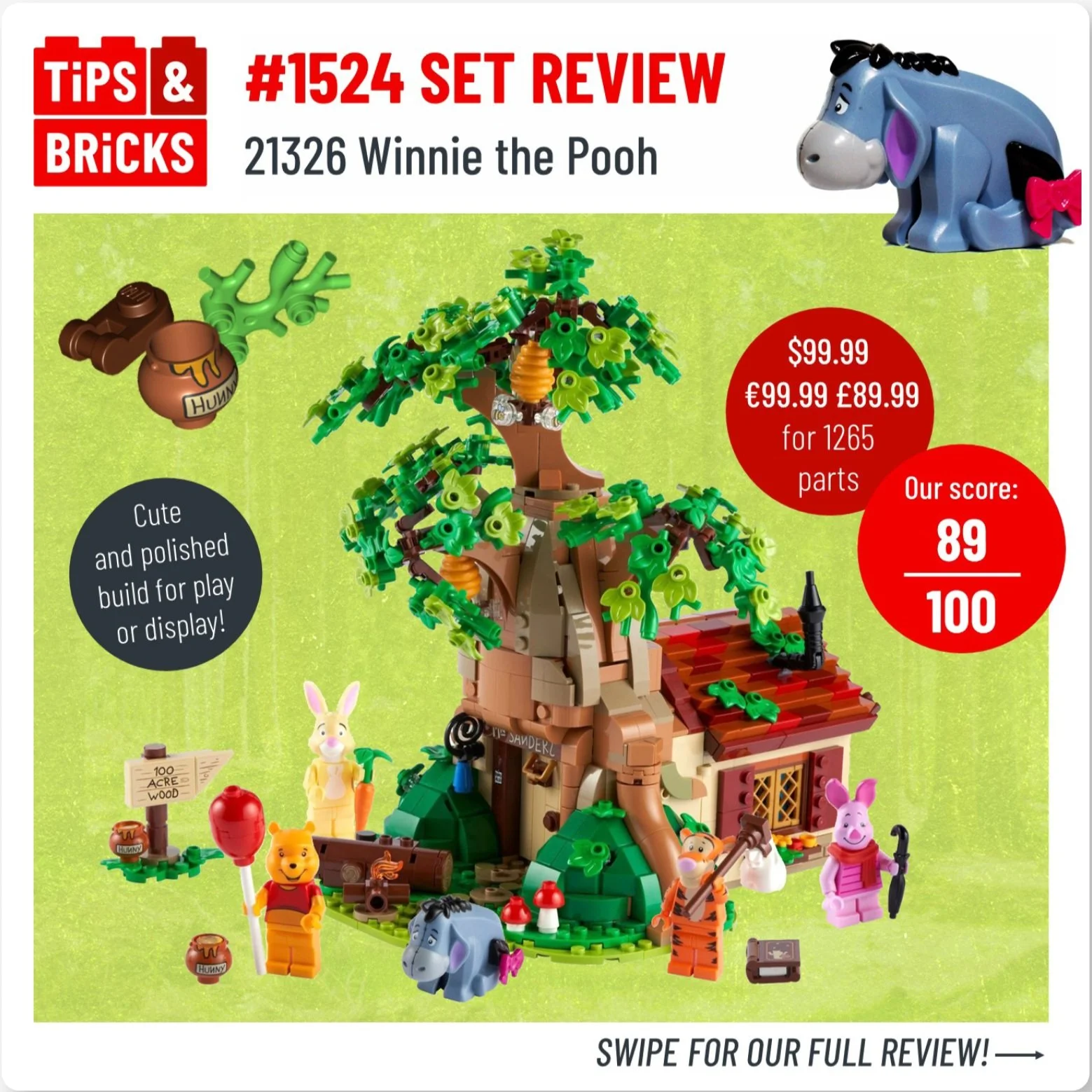
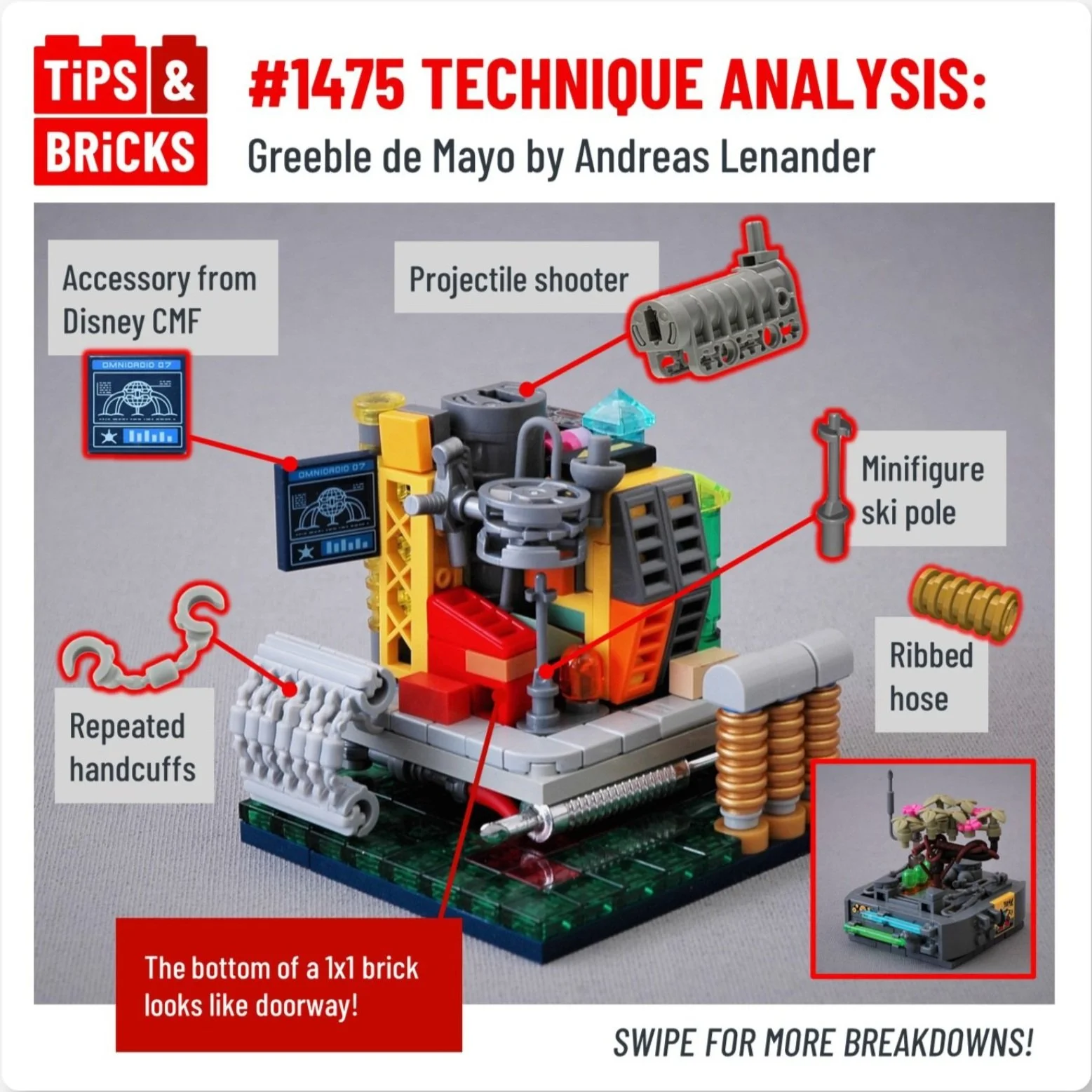
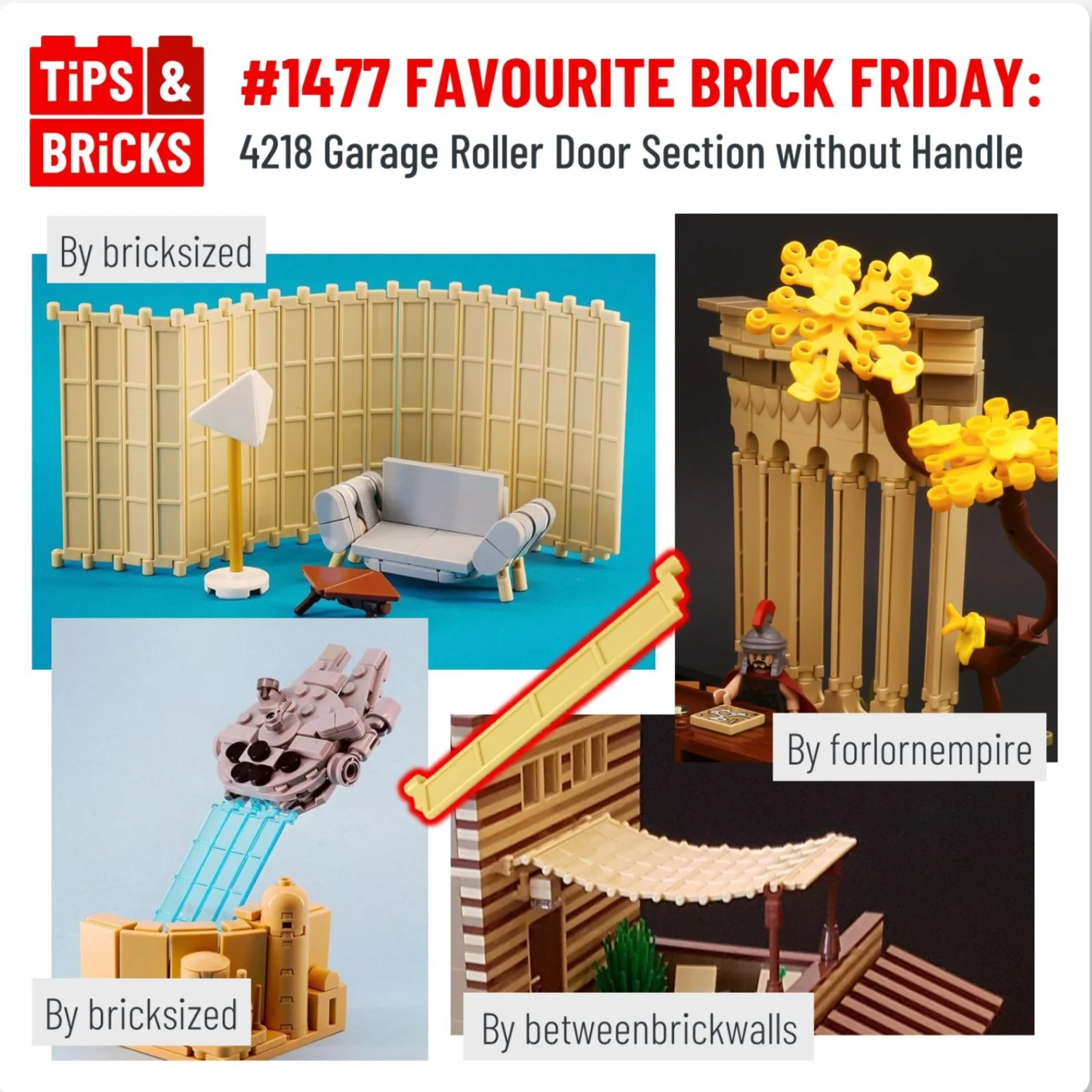
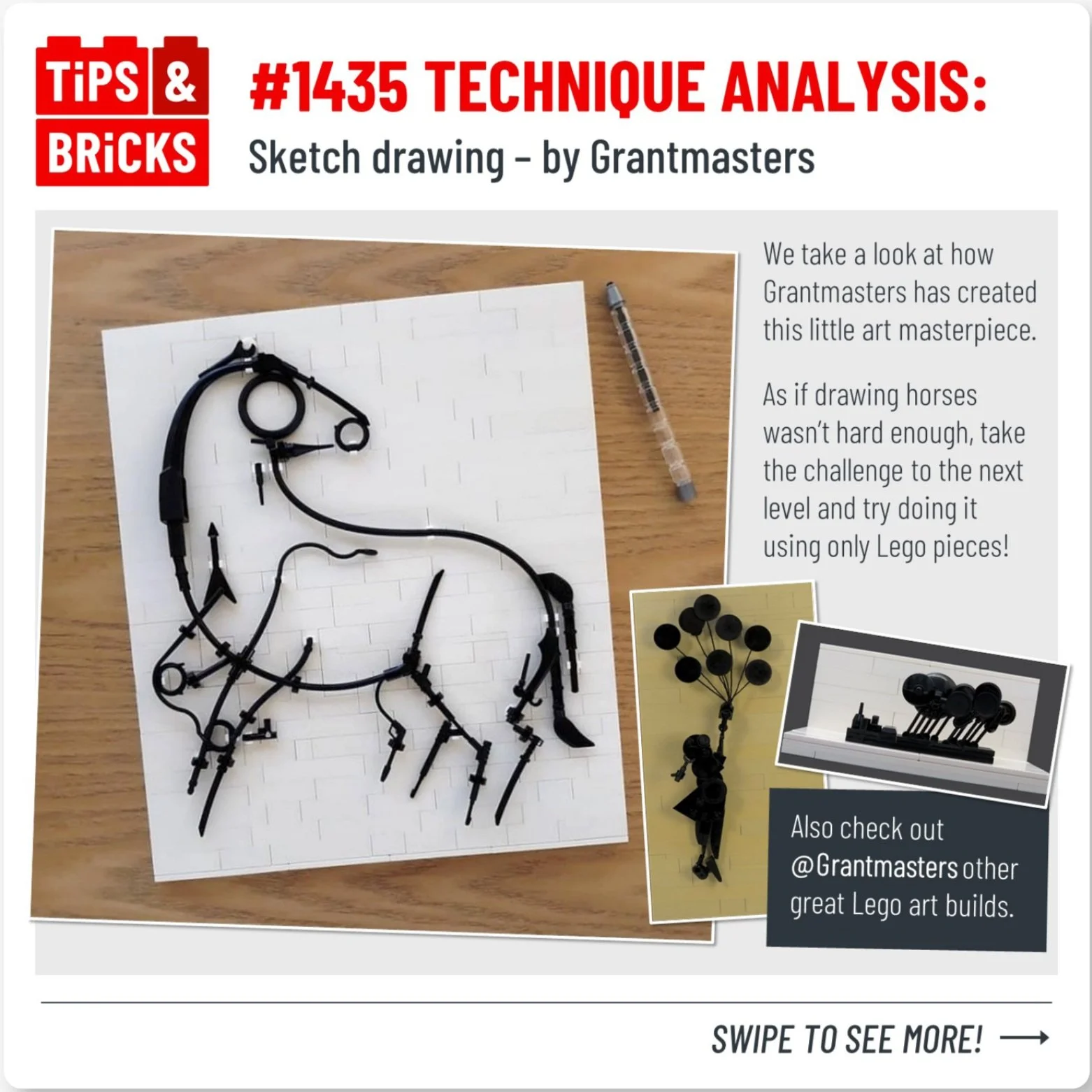
Tips&Bricks
BUILDING A BRAND UPON SOLID BRICK FOUNDATIONS
Tips&Bricks is one of the leading online blogs for AFOLs (Adult fans of Lego). Through daily posts, they promote, celebrate and share interesting building techniques, creations and ideas to audience of over 100,000 followers around the world.
The blog is officially accredited by The Lego Group as a Recognised Fan Media platform.
BRAND IDENTITY | GUIDELINES | WEBSITE | EDITORIAL PUBLICATION
-
In recent years the Tips&Bricks has grown and developed rapidly, whilst the original logo and limited branding had been left without evolving with the blog. Being a social media based blog, it is vital to have a visual identity suitable to perform on digital channels, which the existing logo was not capable of doing successfully.
-
The blog aims to create a supportive and educational online space for everyone from experts to beginners to view, chat and be inspired by all things regarding Lego.
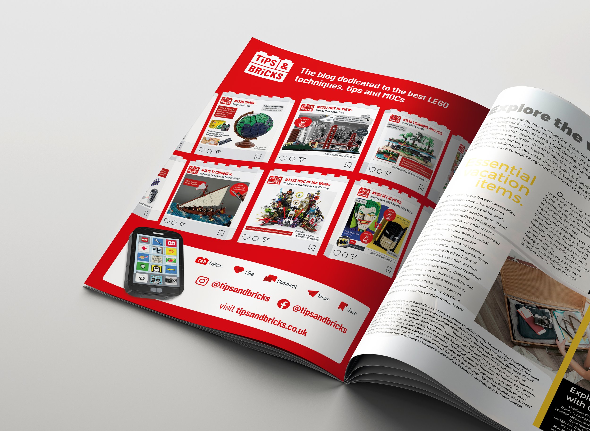
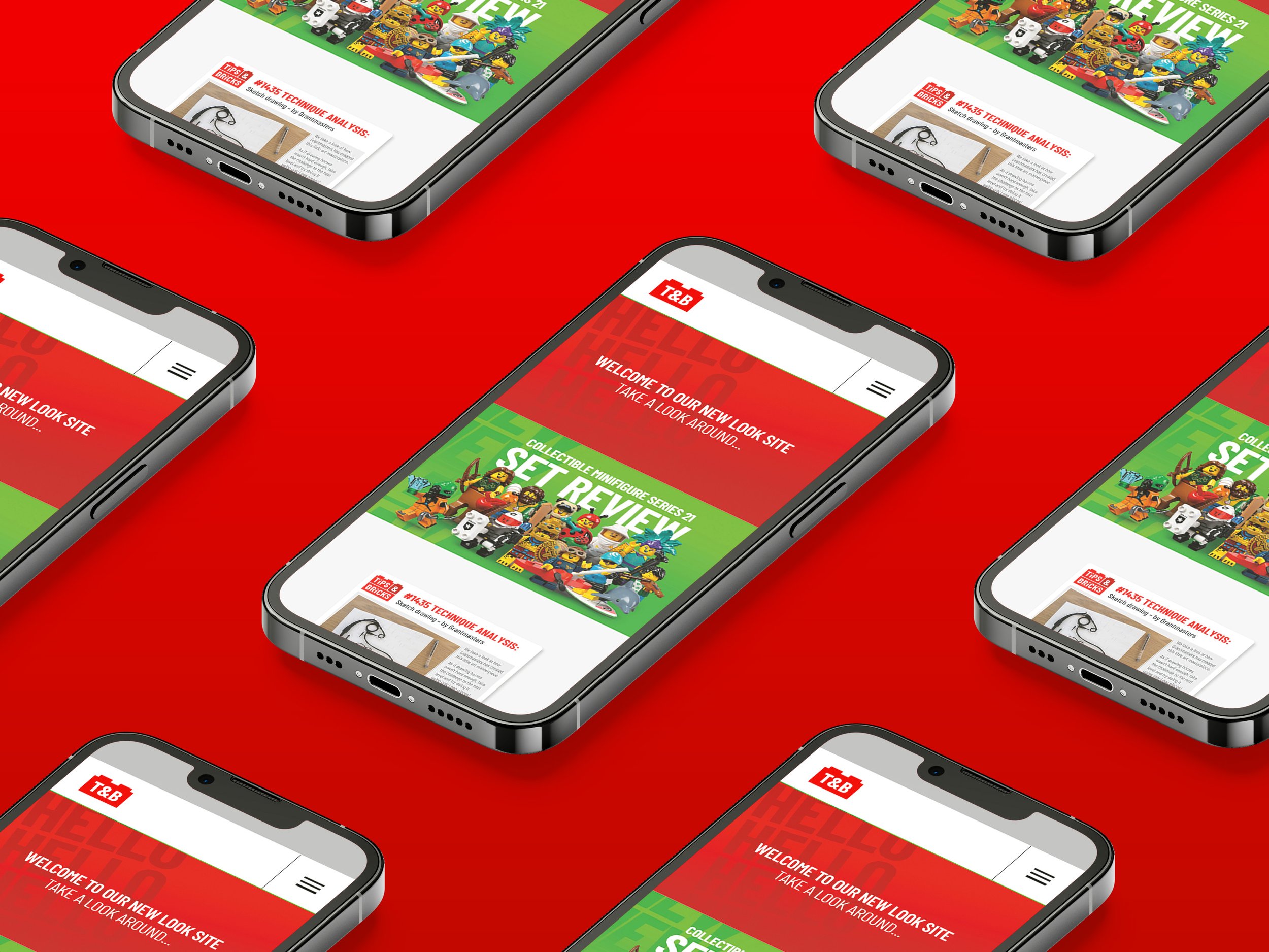
Being based across multiple social media platforms along with their website, tipsandbricks.com, which hosts their post archive.
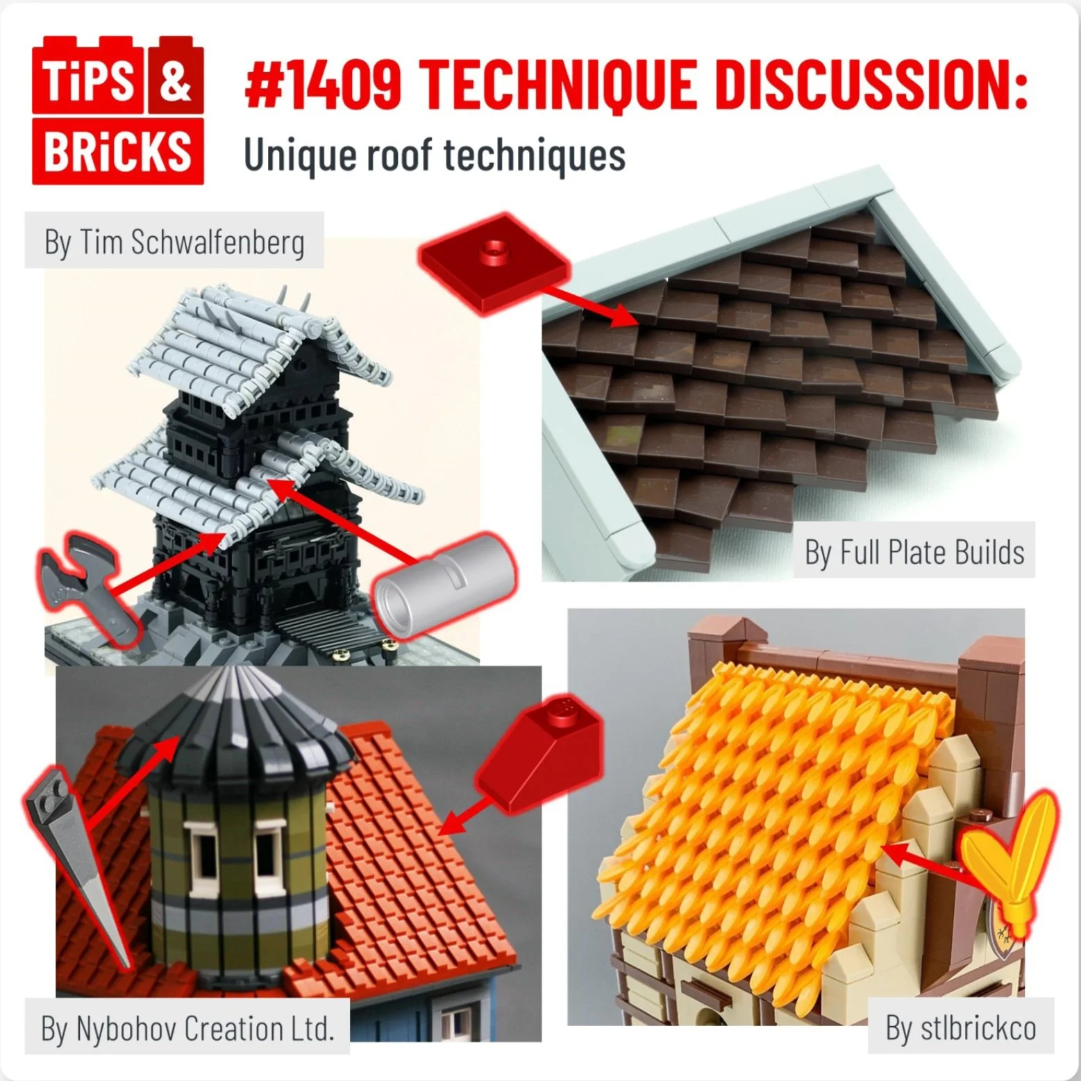
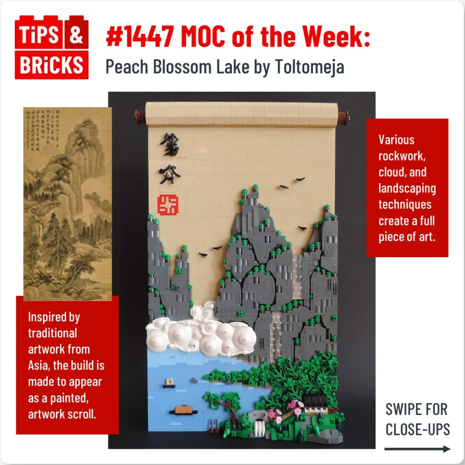
The digital part of Tips&Bricks involves regular posts on their Instagram reporting on the latest set releases, product reviews, showcasing fan MOCs (My own creations) models, plus supporting diversity across AFOL communities, and ofcourse highlighting unusual brick techniques from around the world.
-
Given how the blog has become beloved for its critical set reviews and promoting challenging building techniques it was soon apparent how important detailing and precision in design choices along with high end finishing touches would be across the new brand.
Every visual element was throught about - how could it relate back to the iconic plastic brick product? What hidden meaning behind the colours choices, fonts selection and graphic system could be developed?
CREDIT: jonquinnell.com


NEW LOGO
OLD LOGO
Logo evolution
The new logo identity follows the style and concept from the previous blog logo.
However the new version is not only simplified for digital use, but the size and proportions follow the real life proportions and ratio of actual Lego bricks.


Building a logo with meaning and accuracy
Tips & Bricks is the home of all thing technical, precise and interesting in the world of Lego. So it was only appropriate to build the logo with the same level of detail.
It is form from the ratio dimensions of singular 1x1 stud Lego Brick, accompanied by 1x2 and 1x3 bricks to complete the final construction.
Colour palette
The two red tones have been retained, but enhanced to be distinctive and vibrant when viewed on screen.
In addition to being accompanied by a new Bluish Grey as secondary brand colour.


New font family
The Barlow font family is naturally crafted to be as suitable and effective on digital platforms/screens.
The distinctive tall and narrow character forms are an uncanny resemblance to the font used by Lego found upon every brick every made.


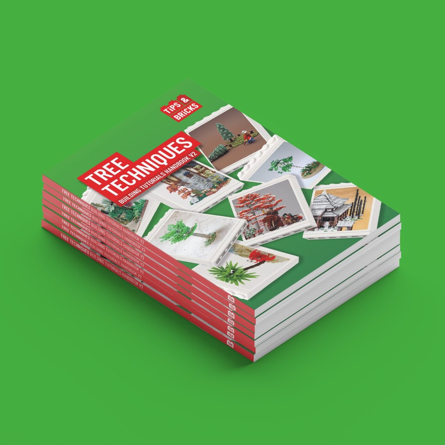
Tips&Bricks produce printed handbooks full of examples of techniques from lego fans all over the world.
The handbook template has been updated and redesigned to align with the new brand identity.